by Danish Ali Detho | O365 & Power Platform Solution Architect///
In today’s world, data analytics has to become pivotal for making informed decisions and decision-makers are always keen to find new and innovative ways to improve their knowledge about their customers. One of the key facets of that information is the geographic of your customers especially when your customers are geographically scattered around the county or World. This allows organizations to know which regions are performing well and where do they need to focus more to improve their presence. The most efficient way to present such information is through a map chart and the Power BI team recognized the importance of it which is why Microsoft has teamed up with ArcGIS to integrate their digital mapping and location analytics software solution in Power BI and provide their customers an exceptional mapping solution for presenting the geographical data. In this blog, we will take a look at this new mapping solution called ArcGIS for Power BI, how to utilize it using live data coming from SharePoint Lists and what benefits it presents to the customers.
What is ArcGIS Maps for Power BI?
ArcGIS Maps for Power BI is a comprehensive and scalable digital mapping and location analytics software solution which allows you to create compelling data stories with mapping, analysis, and insight capabilities. It incorporates an additional layer of depth to data analysis within Power BI. ArcGIS for Power BI is a tool that enables you to map and visualize your data geographically. It also provides the world’s leading spatial analytics tools along with a comprehensive collection of global data which can help decision-makers to understand patterns and trends that are difficult to present and visualize in charts, tables, or spreadsheets.
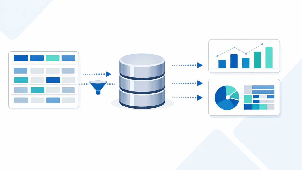
AxioWorks SQList continuously export SharePoint lists and libraries as normalised SQL Server tables, making live SharePoint data available to reporting tools like Power BI, Crystal Reports, or SSRS.
Main Features of ArcGIS Maps for Power BI
Improved data insights
ArcGIS maps have built-in smarts to identify geolocation data. It can convert any location whether be an address, city, state, ZIP code, place-name, boundary, or latitude-longitude into points on a map. The built-in smart mapping capability helps users to choose the right style and display the associated data.
Spatial analysis on mapped data
Spatial analysis helps users to enhance their understanding of mapped data by mapping relevant locations and spotting relationships and patterns i.e. adding more relational visuals on the report. This allows us to create heat maps with a click, aggregate data into clusters, determine drive time, and reveal hidden patterns in your data with ArcGIS.
Improved data accuracy and security
Geolocation information from your dataset in Power BI is sent to Esri servers to find locations and render them on the map. The data is never saved or stored on Esri servers because any interaction with Esri servers is transient.
Contextualize your data
ArcGIS spatial analysis tool helps you to identify the spatial facets of your data like Identifying a location in relation to other critical variables such as income, population, or weather. This gives you the power to set up multiple visuals showing other critical information and then control them using the Map.
Create an ArcGIS Map Visual using data from SharePoint List
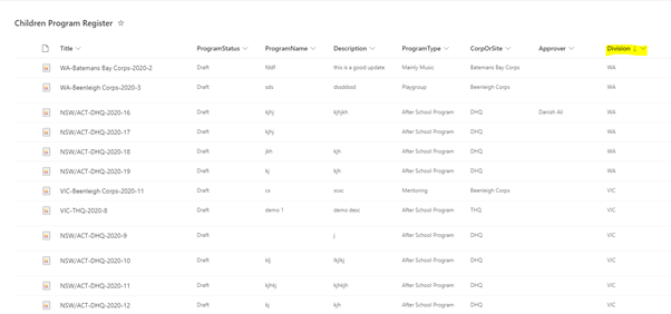
Now, let’s create an insightful map visual using a SharePoint List. You can use any list which has some sort of location info whether it be addressed or state/City/country. I will use the Programs data categorized by states in Australia. For the location, I will use a normal Choice Column which has a list of all the Australian states.
Let’s open the Power BI Desktop and connect to a SharePoint List data source that contains the mapping data. Now click on the ArcGIS map visual from Visualizations.
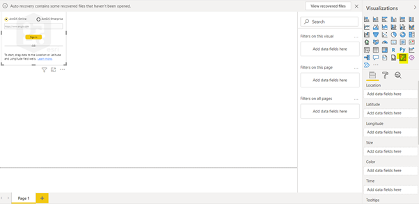
You will need to create a trial account by going to https://www.esri.com/en-us/arcgis/products/create-account. Once the account is created, you can then set up your organization map. Afterward, go back to Power BI Desktop and then sign in using the account you just created.
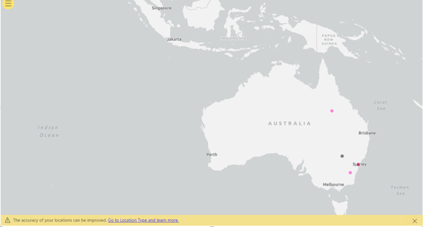
Now, I will simply drag and drop the division column to the location field. This will render the Map with data points on it for each state.
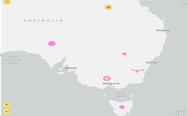
This is pretty much what we can do with OOTB Maps visual too. Now, let’s dig deeper and use some other available fields. Size field changes the size of the pointers on the map based on some specific numeric data whereas the Color field can be used to distinguish the pointers on maps by setting a different color for each pointer on the map. Lets, add the count of items to show which state has the most programs running.
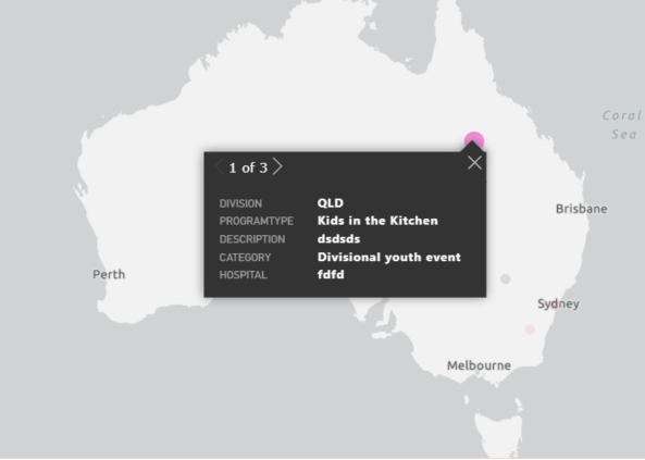
We can add multiple fields in the tooltip field to show relevant data when the user hovers over the pointer on the map.
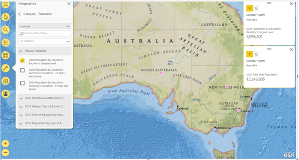
Let’s look at some cool features which make it stand out from the OOTB map visual. You can set different map themes from the map settings on the top left using Basemap. And you can also display additional info as well. For our example, Lets select the size of population and population of educated people.
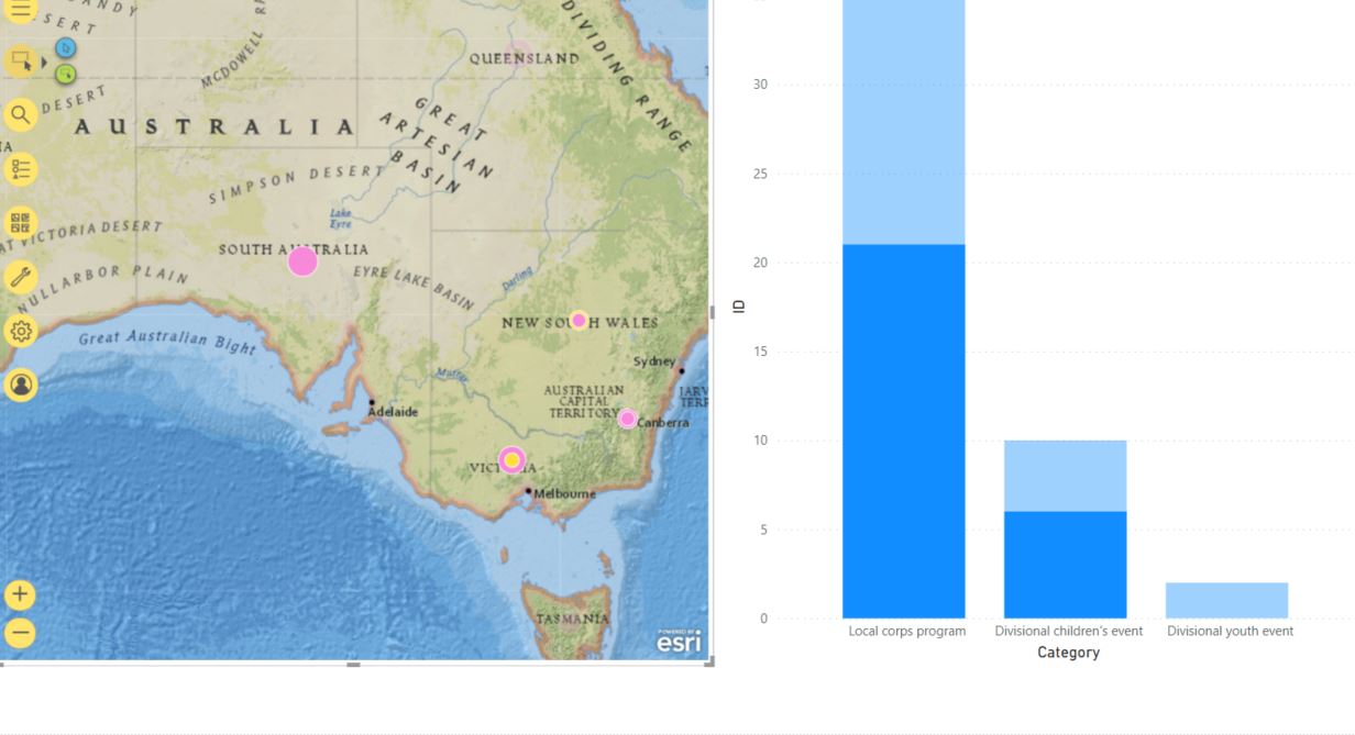
Another great feature is to show spatial data by showing relevant data in other visuals and then changing the data visualization by selecting one or multiple points on the map. Let’s add a stacked chart that shows programs in each category and then select multiple states on the map.
Final Thoughts
AxioWorks SQList continuously export SharePoint lists and libraries as normalised SQL Server tables, making live SharePoint data available to reporting tools like Power BI, Crystal Reports, or SSRS.
ArcGIS Maps brings a whole heap of geo-enabled data analytics goodness to Power BI which will allow power bi users to create stunning map reports that will allow the business users to visualize the geographical data in various different ways as well as being capable to perform real-time business intelligence on the data in order to make efficient decisions. They will not only be able to visualize accurately mapped data but will also be able to leverage geostatistical data coming from Esri servers to understand the demographics of areas they are interested in making the reports even more insightful. The maps will also be integrated with other visuals on the report to allow users to do some Spatial analysis on runtime by selecting different points on the map.